Getting to make all the design decision for your best friend’s house is a DREAM! It’s like getting to do it for yourself, only it’s not your money – hahahahaha! But seriously, I call it my Model Home and I plan on sharing more and more as we get furniture in. I shared a kitchen photo on Instagram recently and you guys LOVED it. So, I thought I’d share some of the fixtures and finishes we chose to really make the space come together.
PRODUCTS
Her kitchen turned out even more beautiful than I could’ve imagined. Most everything was sourced locally, of course, but I’ll do my best to cover everything that I can.
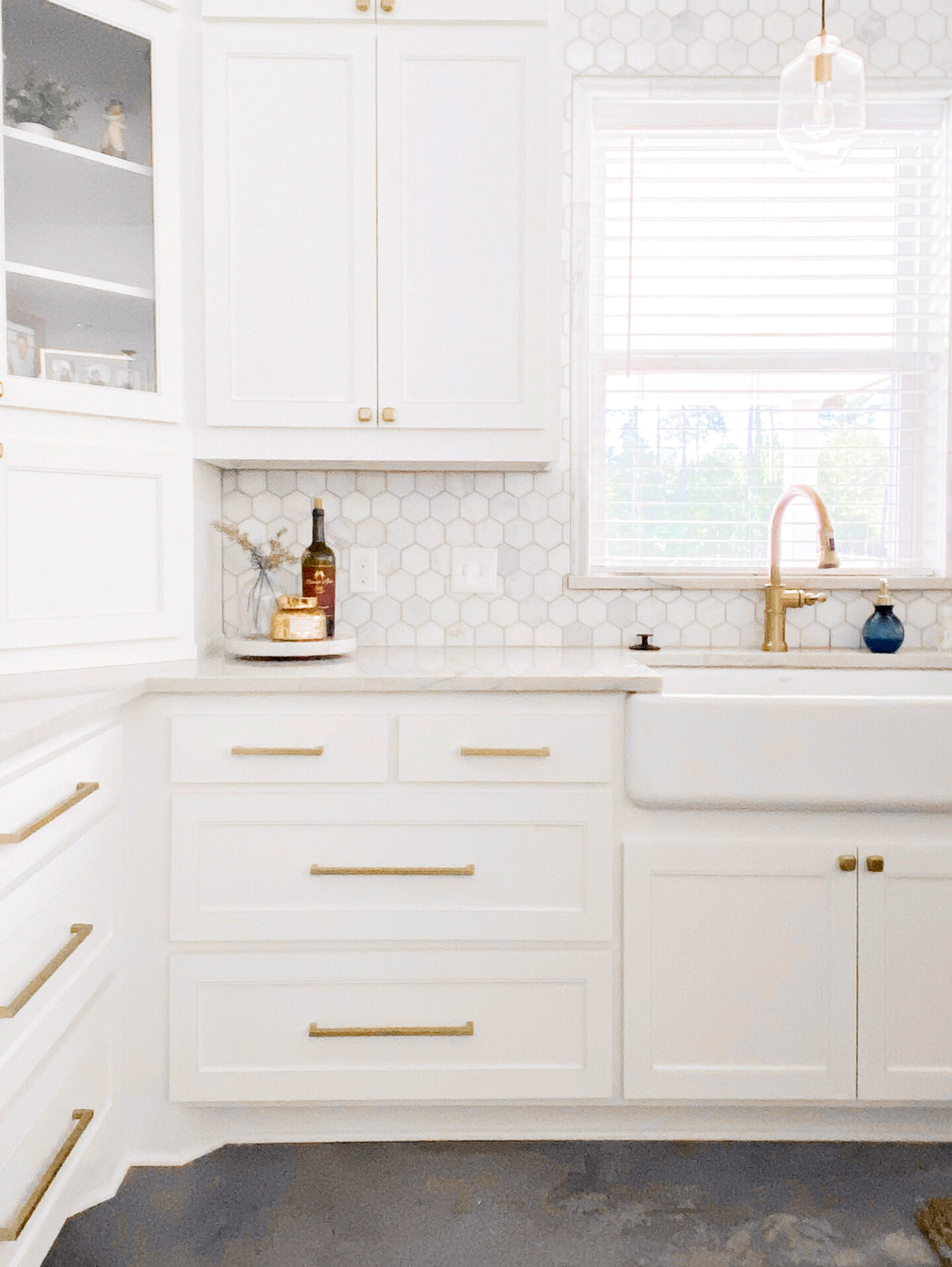
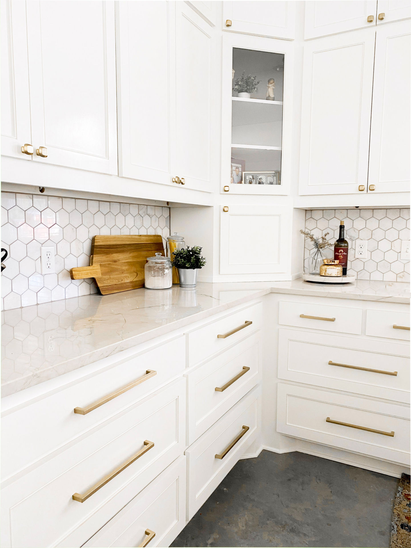
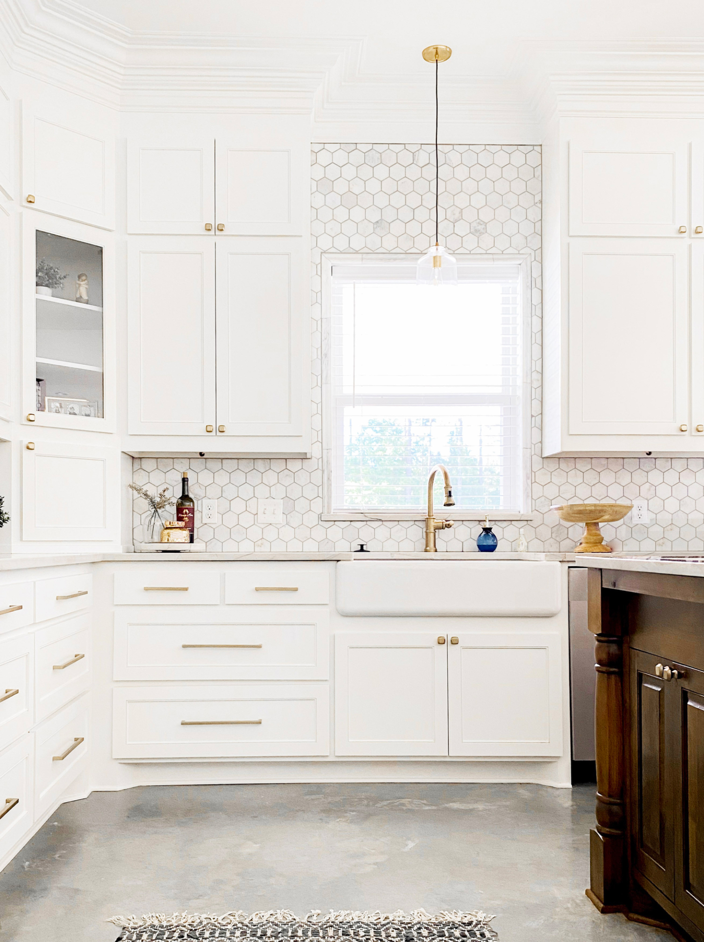
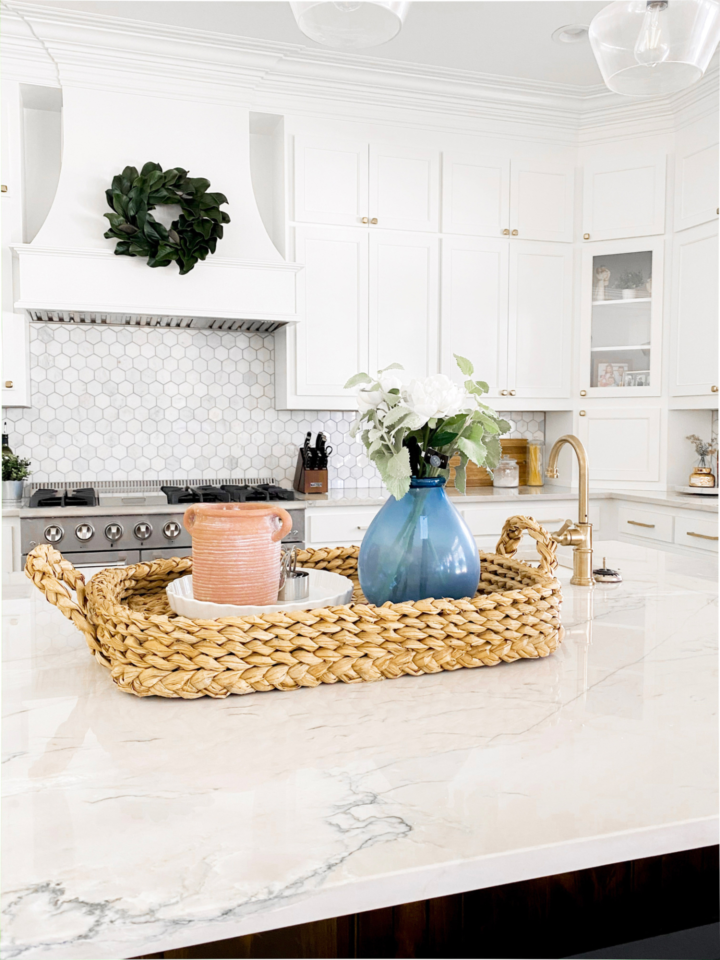
Her cabinets are a modified shaker style with just a touch of added detail suggested by the cabinet guy and we loved it! It’s a totally classic look that will carry her forever and always make her home feel clean and beautiful.
The biggest question that I get is paint color. Ashton’s entire house, top to bottom is Benjamin Moore White Dove. The cabinets and trim are done in a satin finish, walls in eggshell, and ceiling in flat. It’s a spectacular warm white and we’re obsessed. The island is a stained wood. I don’t know the exact color because I just approved the samples once they tested them on a piece. This is something I highly suggest whether you’re working with a designer or not. Sample your paints and stains on multiple walls and surface before making a decision to avoid making the wrong choice. Sometimes the lighting in your home makes one color appear different than it does in another home. We tried out stands on a scrap piece of wood from the cabinets and chose based on that.
We obviously chose gold hardware and fixtures throughout. The island pendants are black metal to match the other fixtures in the home. The lighting was sourced locally but I linked some similar options here and here.
The cabinet hardware is from gold as well. Here is the link to the pulls and here are the knobs we chose. The pulls come in multiple sizes so we did a shorter option on the small drawers and a longer one on the larger drawers.
Ashton’s floors on her first level are all concrete. We didn’t stain them at all and just sealed them with a low sheen. We didn’t want to chance getting red or orange tones throughout. I love the way they turned out.
We went with a quartzite countertop which is the strongest stone and the closest to a marble look you can get without using real marble. Quartz is another great options but you have to be a bit more careful with staining and heat. We chose Mont Blanc Quartzite here and absolutely love the look.
The backsplash tile was also sourced locally but is a marble hex tile with a light grout. We made sure to take the backsplash all the way up on the wall behind the sink. I love that it completely fills the sight lines in the kitchen. And since it’s tones work so well with the wall color, it doesn’t create any harsh lines.
As far as the accessories and decor, I did my best to find exact ones or similar options. This will be changing more often but I love what we have going to far.
I hope this helps those of you that had questions about the space! I can’t wait to share more as we go!


