Super excited for today’s much requested blog post. I get so many questions on my instagram about how I edit my photos and what camera I use. The questions have been mostly recent since I’ve only started REALLY editing over the last year or so, but I’m super excited to share my process and give you a little insight on how you can take your iPhone photos from drab to fab! Everyone loves a pretty instagram feed. I’m no professional photographer or editor but I have a couple of tricks up my sleeve.
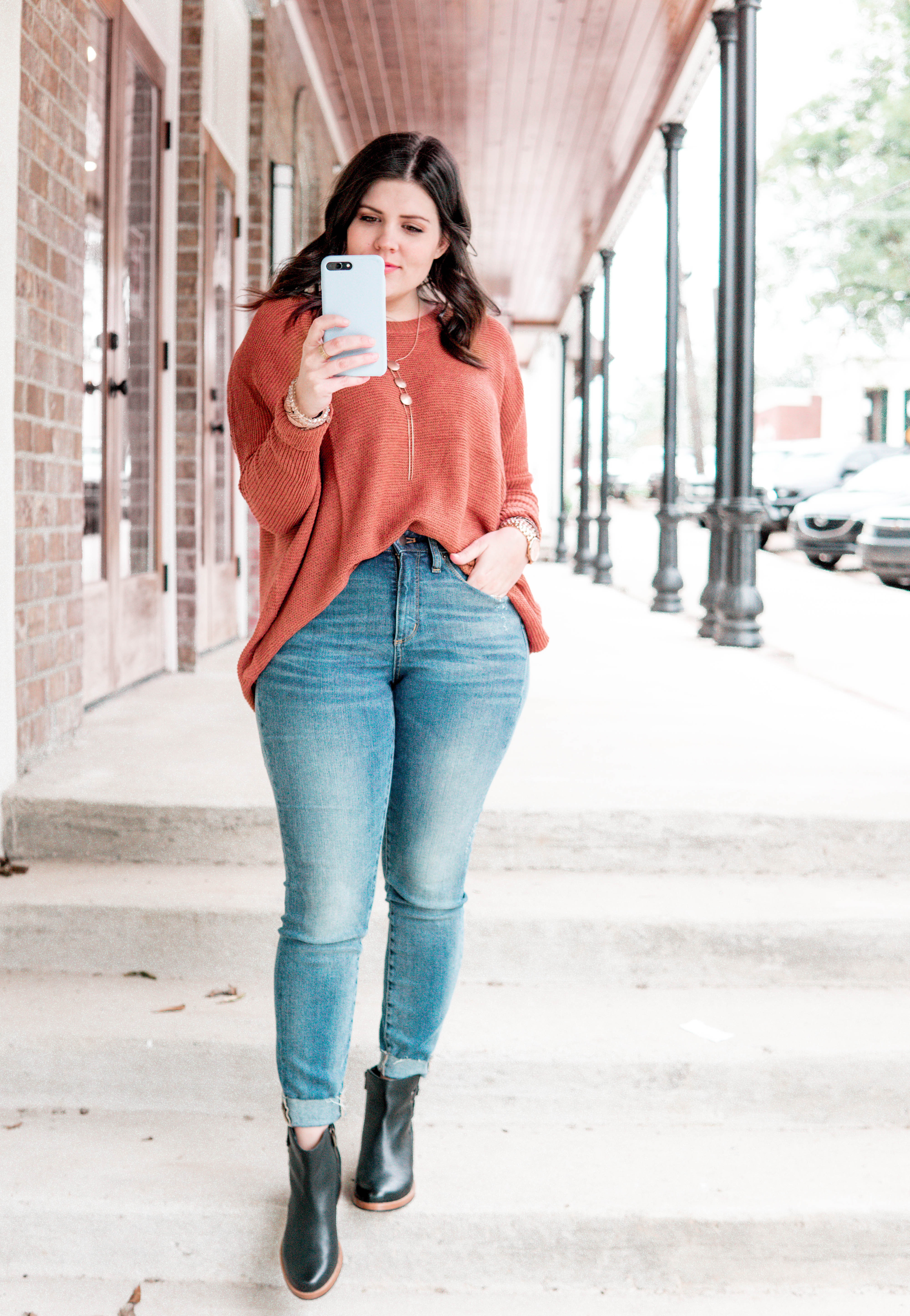
I happen to love a bright, light, clean image. If you like dark and moody, this tutorial can still help you, but you’ll probably be doing the complete opposite of what I say! Remember that this takes lots and lots of practice. You’ll get better and better at it the more you work on it. A couple quick tips.
- Don’t over edit. If you find your image is starting to look blown out or over edited, revert to the original and start over. If you continue to add filter after filter or edit over previous edits, you can end up getting a muddy, over-edited photo that looks unnatural.
- Go easy on the face tune. I DO use face tune for several things. I’ll talk about them later. I don’t think it’s a crime to get rid of a blemish or smooth out a really rough patch, but don’t smooth your whole face or get rid of too much definition on your body. It’s going to make your photo look like mush!
- Find an instagram feed that you love and start to pay attention to the colors that they use and backgrounds that they choose. Part of a having beautifully curated feed is being intentional about what photos you take and post.
- NATURAL LIGHT IS ALWAYS BETTER. Period. Artificial light is MUCH harder to edit. That’s just a fact. Try to get as much natural light as you can in photos.
Ok. here we go! There are 4 very important apps that you’re going to need to have in your arsenal. The first is the PREVIEW app. This is what I use to plan out my instagram. I can rearrange my photos to figure out which way they look best and in what order I should post. This is a super helpful app if you want to see what your feed is going to look like before you start posting. I ALWAYS ALWAYS USE IT!
This first editing app you want to download is Lightroom Mobile. I use the real Adobe Lightroom to edit all of my camera images on my computer. (PS: I’m currently using a Sony A6000 – but this is about iPhone Photos). The Mobile app is free to use which is great but it takes a little getting use to.
Many of you have probably heard about Lightroom Presets. These are basically a pre-made group of settings that you can apply to any image. It helps to make your images look cohesive because they’re all edited using the same lighting and color settings. I’ve made my own preset but here are some great sources for amazing presets. They typically cost around $15 for the lightroom version but they are SO worth it if you want a gorgeous feed.
- Emily V Presets – Darker and Moodier but so gorgeous!
- Tezza Presets – Warm and Vintage Look
- Presets by Danielle – Bright, so pretty. Probs my fave. If I bought some, this would be what I would buy.
- Hunters of Happiness – Bright, Airy. Probably the most natural.
There are so many great presets out there so if these don’t tickle your fancy, just google more. Just be sure that you have access to the MOBILE preset! It’s different that the original. There is a way to get a preset from your Lightroom to LR Mobile but it’s complicated. I won’t get into it here.
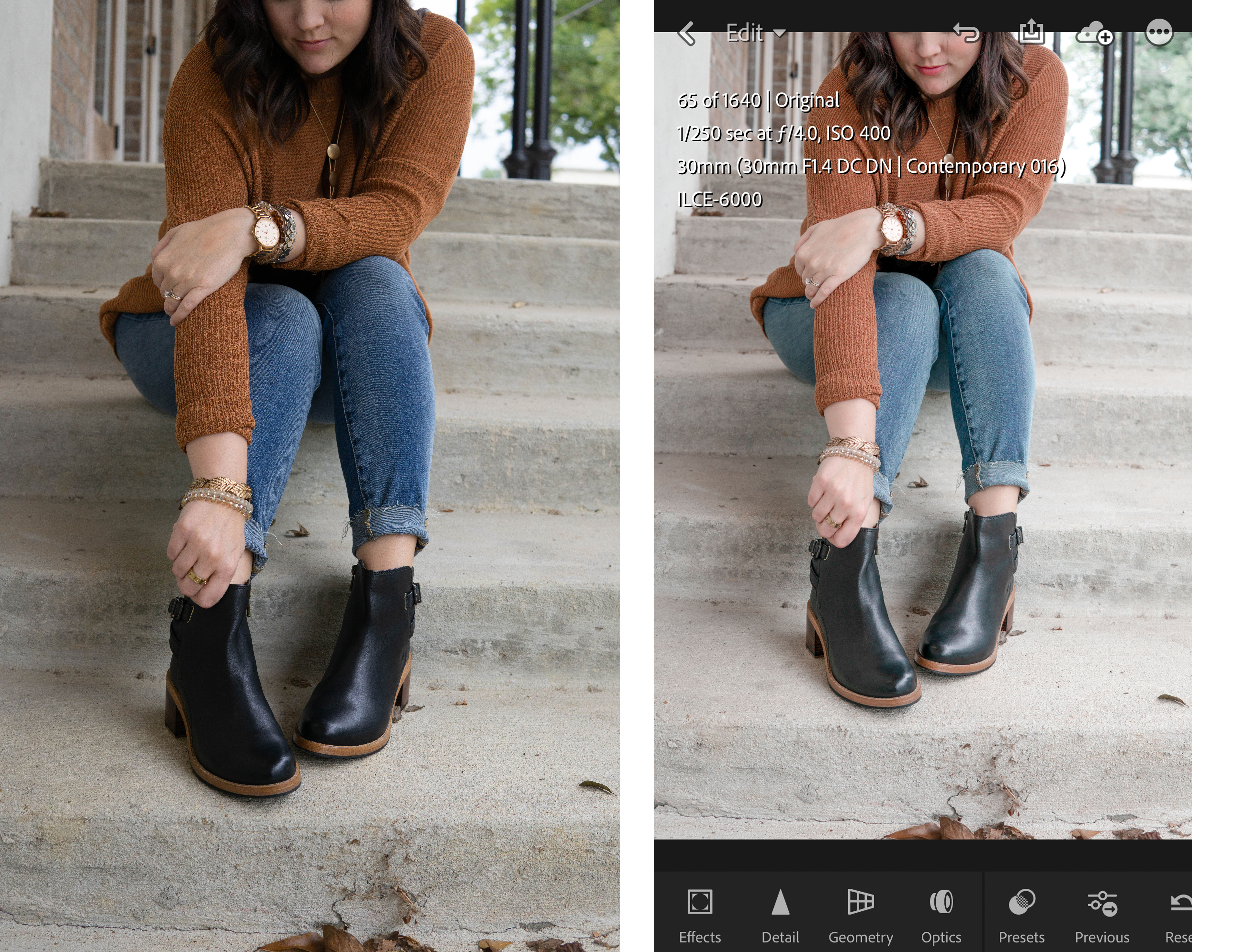
So let’s start. Here is a photo we took last week. The before version and then in the app after I applied my own preset. You can see it brightened it and adjusted some of the colors.
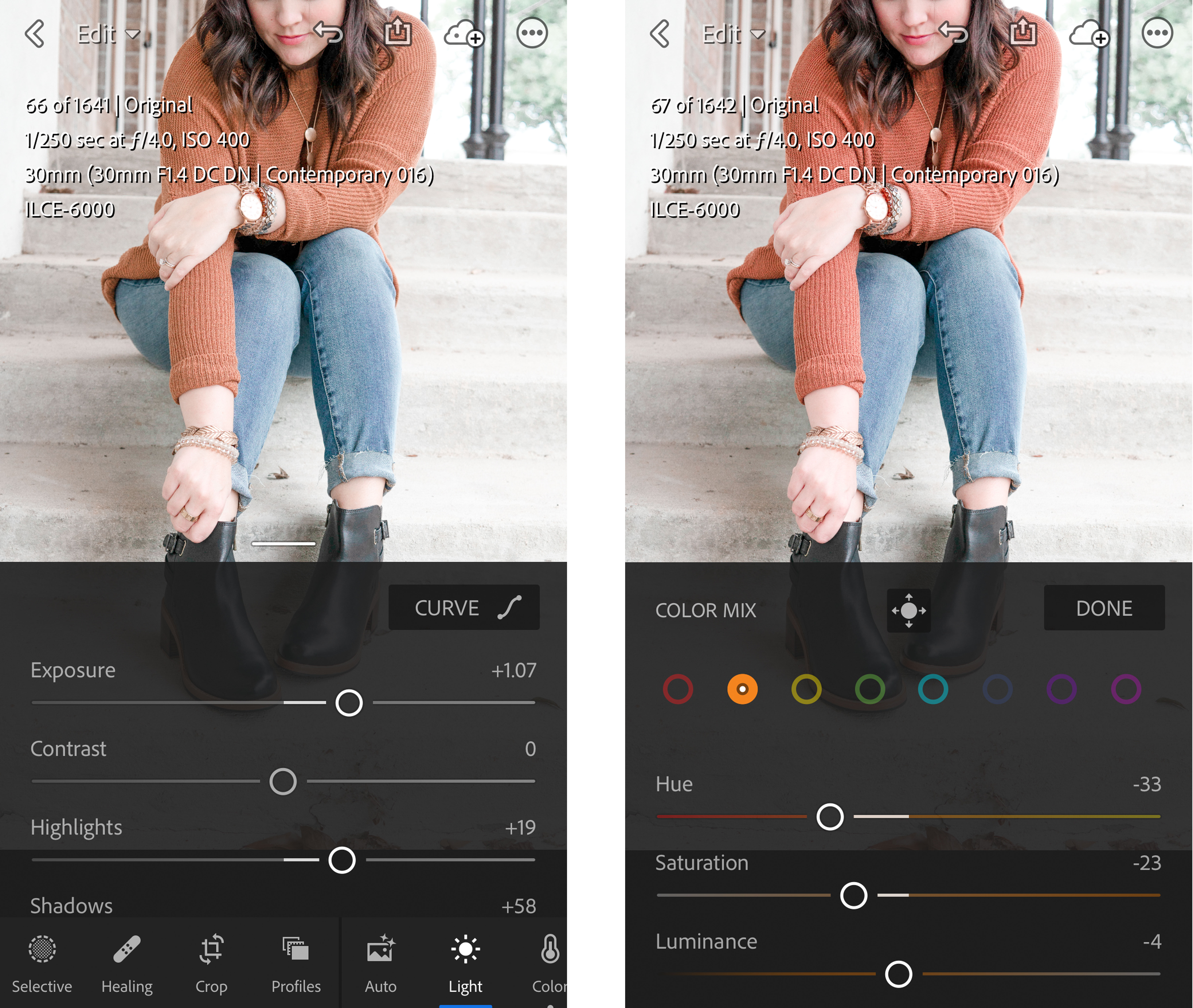
From there, I still like my photos brighter. You could totally stop there if you like that but I want brighter. And I like my oranges to pull a little on the pink side so that they’ll mesh well with the pinks I already have on my feed. The below image on the left show how I brightened up the photo using the Exposure tool and the Whites Tool. Then the right shows how I went in and edited the individual Orange Hues to be a little pinker.
This app is so amazing because you can literally turn one color into basically a different color if you need to! I encourage you guys to play with the sliders until you find a place you love! Experiment with what they can do!
I also use Lightroom to crop because you can come back later and revert to your original if need be. Or if you crop it too close, it’s easy to edit!
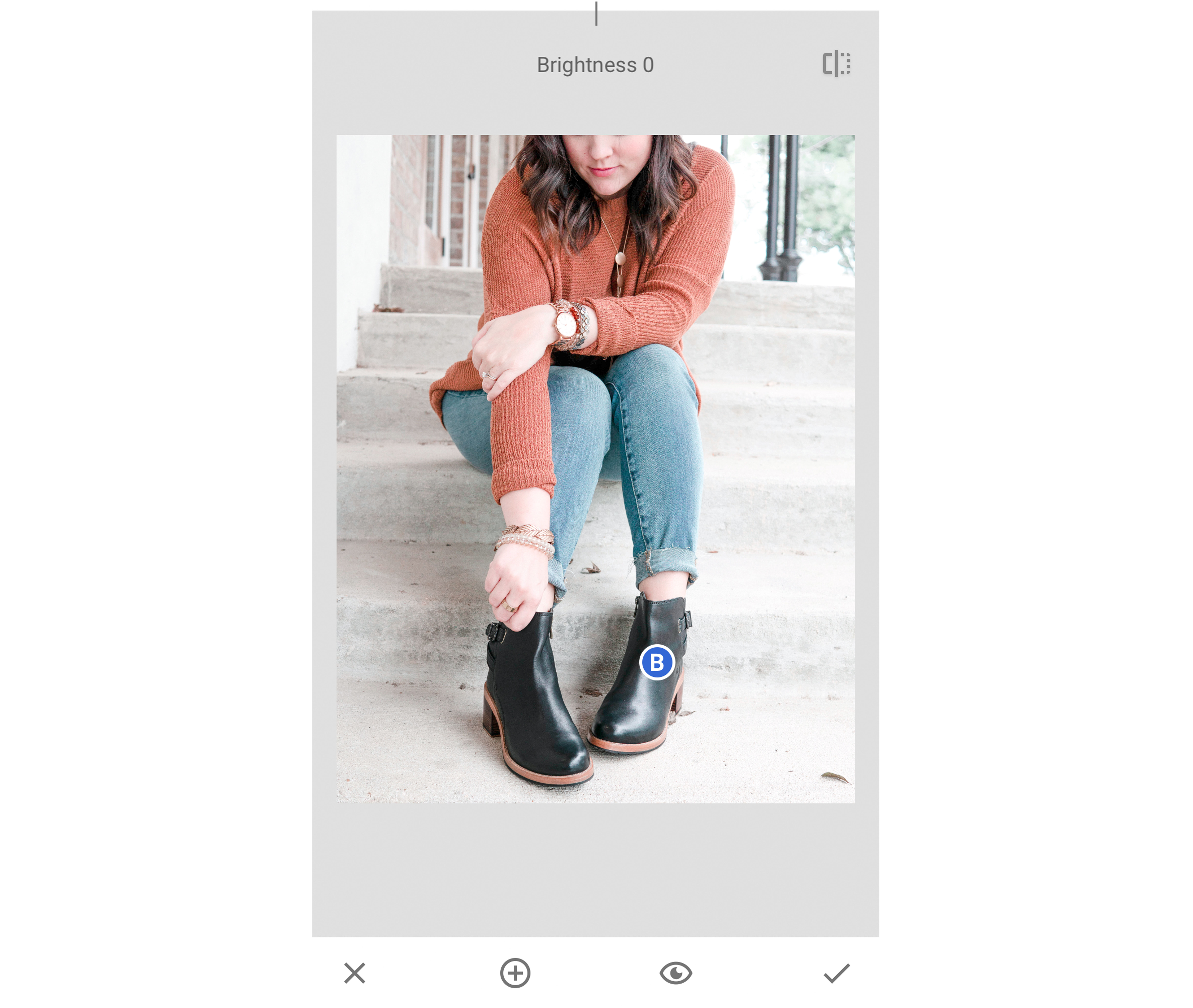
After I’ve got all of my levels the way I want them, I typically open up the image in Snapseed. Another great editing app. I typically brighten up the image a bit in this app. It has an overall brightness tool instead of the many faceted one in Lightroom that controls exposure, whites, shadows, etc. all with different levels. That way I can just quickly brighten an image.
Fun fact, images loose brightness online. Or at least I feel like they do. So I typically make an image a bit brighter than I normally would and then online it looks great!
Also, in Snapseed, I use the selective tool to choose areas of similar color. I can brighten them, saturate or desaturate them, and a couple of other things I can’t remember. In the image below, I darkened the black in my boots to really make them pop!
After I’ve played in snapseed a bit, I then open it up in FaceTune. In Facetune, I primarily use two of the tools. First is the whiten tool. Yes. You can whiten your teeth with this but it’s great for so much more!
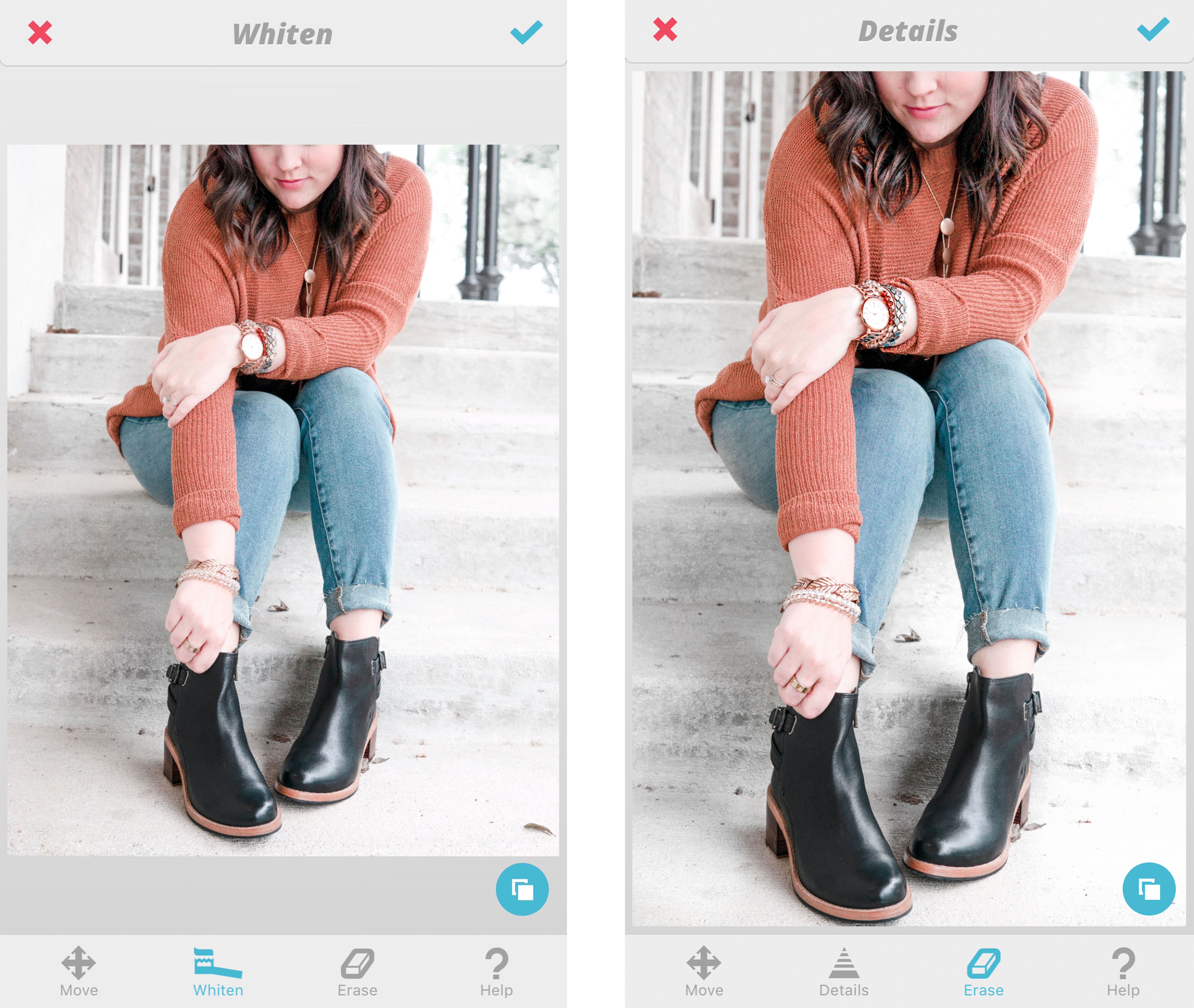
My favorite way to use it is to white the background of an image. This is especially helpful when it comes to artificial lights. You can whiten concrete, walls, anything really and then your background looks cleaner and brighter. In the image below on the left, I whitened part of the stairs on the left side and the upper part of the background. It’s a really subtle change but it makes a pretty big difference in the long run!
The Whiten tool is great for getting rid of those pesky yellow edges that you sometimes get in images that you take near artificial lights!
The other tool I use a lot is the details tool. I typically run it over my eyes, and any jewelry that I have on. And sometimes my hair to give it a bit more dimensions. In the photo below on the right, I added detail to my jewelry and hair. You can see the difference really easily in the two side by side images.
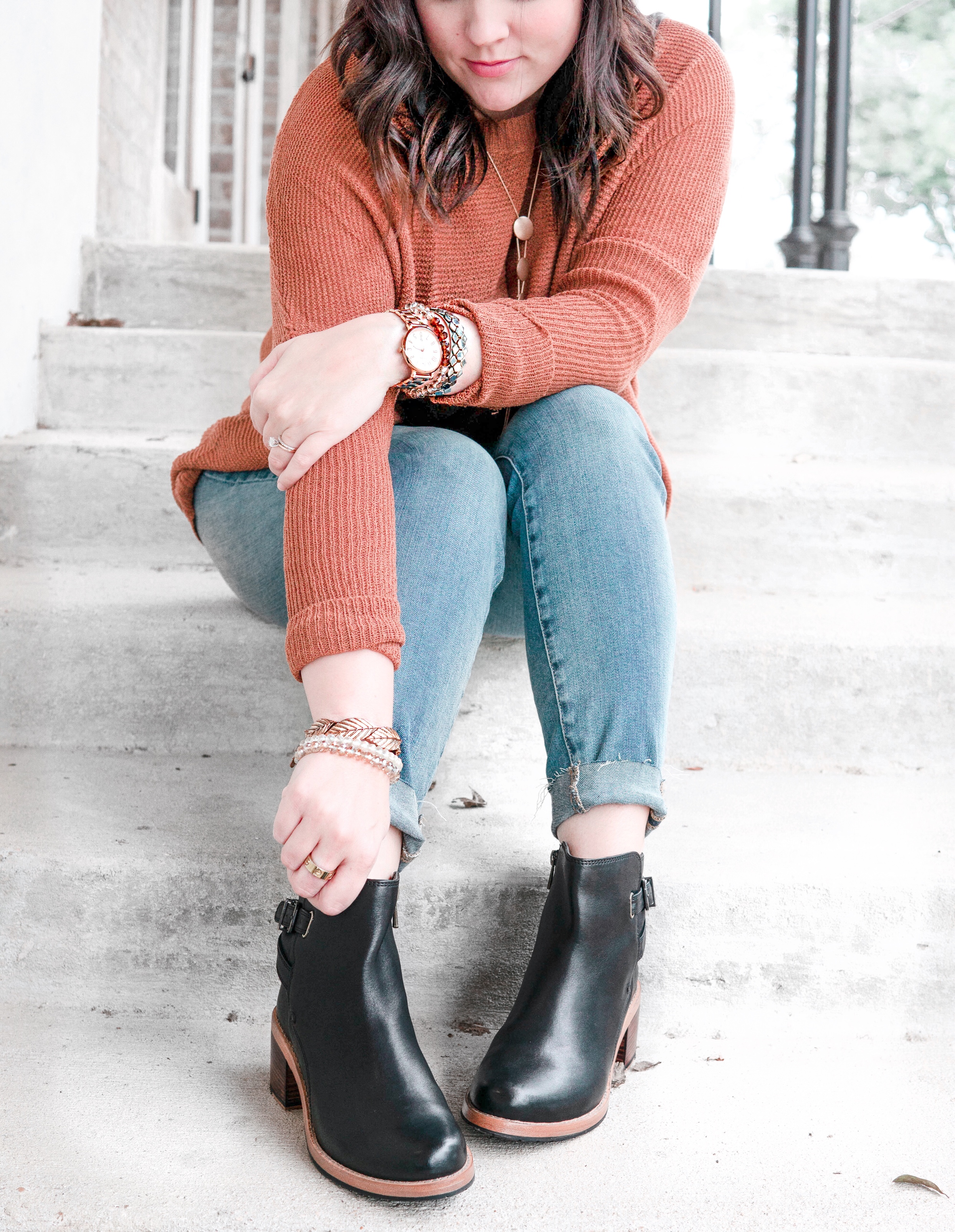
There are so many other things that you can do in the apps. Just remember what I said about over editing! Below I’ve shared the final image! It’s perfect for my feed. I know because I actually posted it yesterday!!
I can’t wait to see all of the wonderful things that you guys do with these tips. If you use them, PLEASE tag me when you post or on your stories! I love to see it when you guys use my advice or follow my DIYs!!!
Happy Editing!


