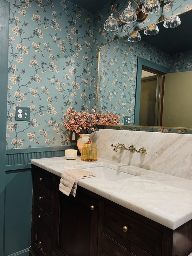
I’m sitting here comparing the before and afters of this space, and I’m having trouble believing it. And I did it with my own two hands. It’s crazy how far this space has come in the last 8 weeks. For those of you who don’t know much about this space, I’ll give you a quick explanation. We have a small, 1000sqft guesthouse on our property connected to our house by a breezeway. It’s one of the reasons that the house was so appealing to us. When we purchased our home, my sister was living with us and looking for a more permanent place. So when we realized she could live in our guest house, it was a no-brainer.
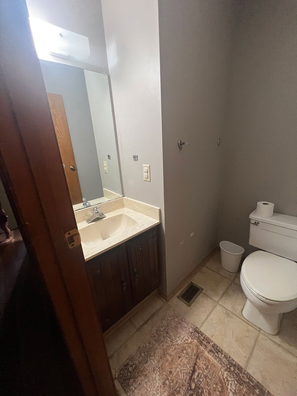
Before I can show you the gorgeous finished product, we have to revisit the space that we started with. It was two bathrooms back to back. There was one full bathroom with a small standing shower. a 24″ vanity with virtually no storage, and a toilet that nearly touched the door to the hallway. The back bathroom was even smaller and only had a toilet and sink. It was only accessible through the second bedroom in the guest house.
There was really zero reason for us to have two bathrooms situated like that. It didn’t serve and purpose and all I could see was the wasted square footage every time I walked in. PLUS, a long term leak under the sink that was happening even before we moved had caused the subfloor to start rotting and literally sinking into the floor. It HAD to come out.
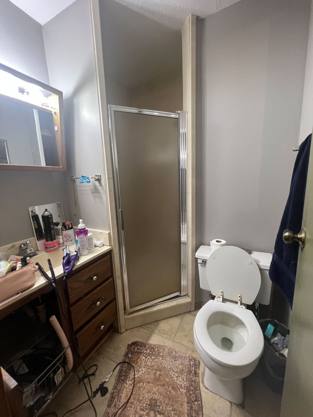
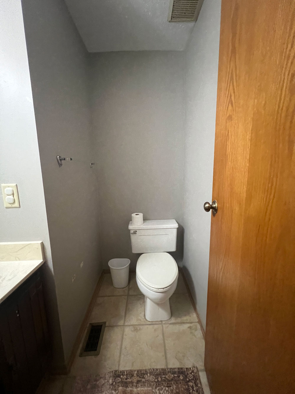
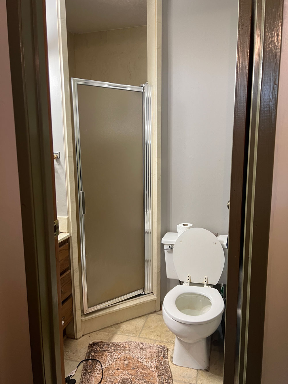
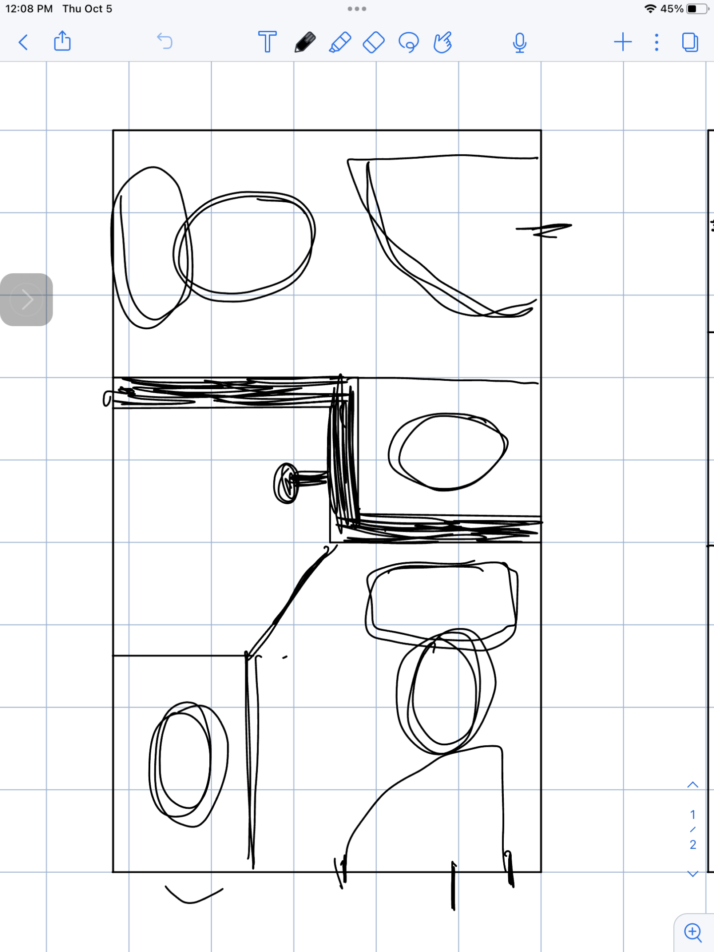
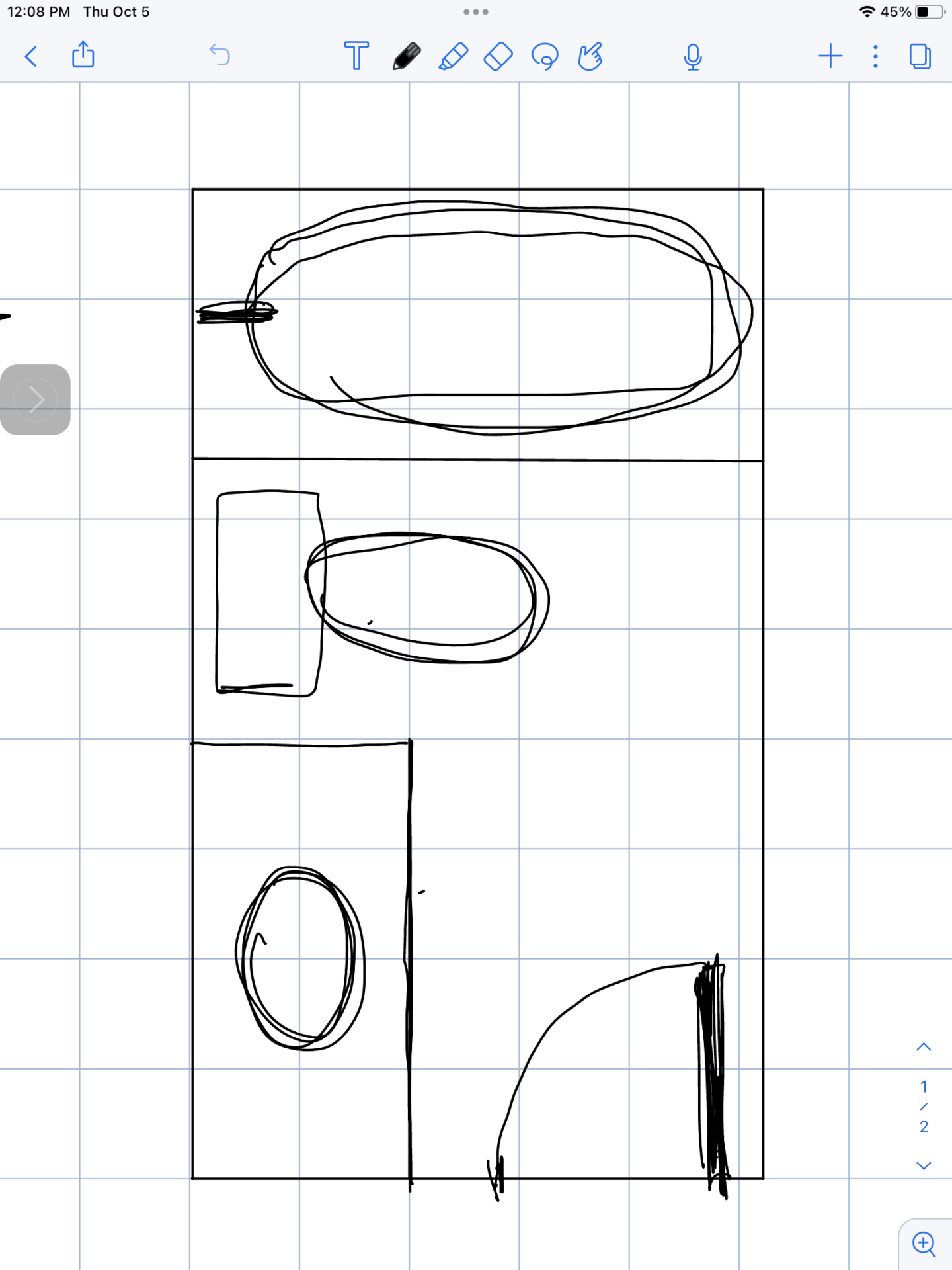
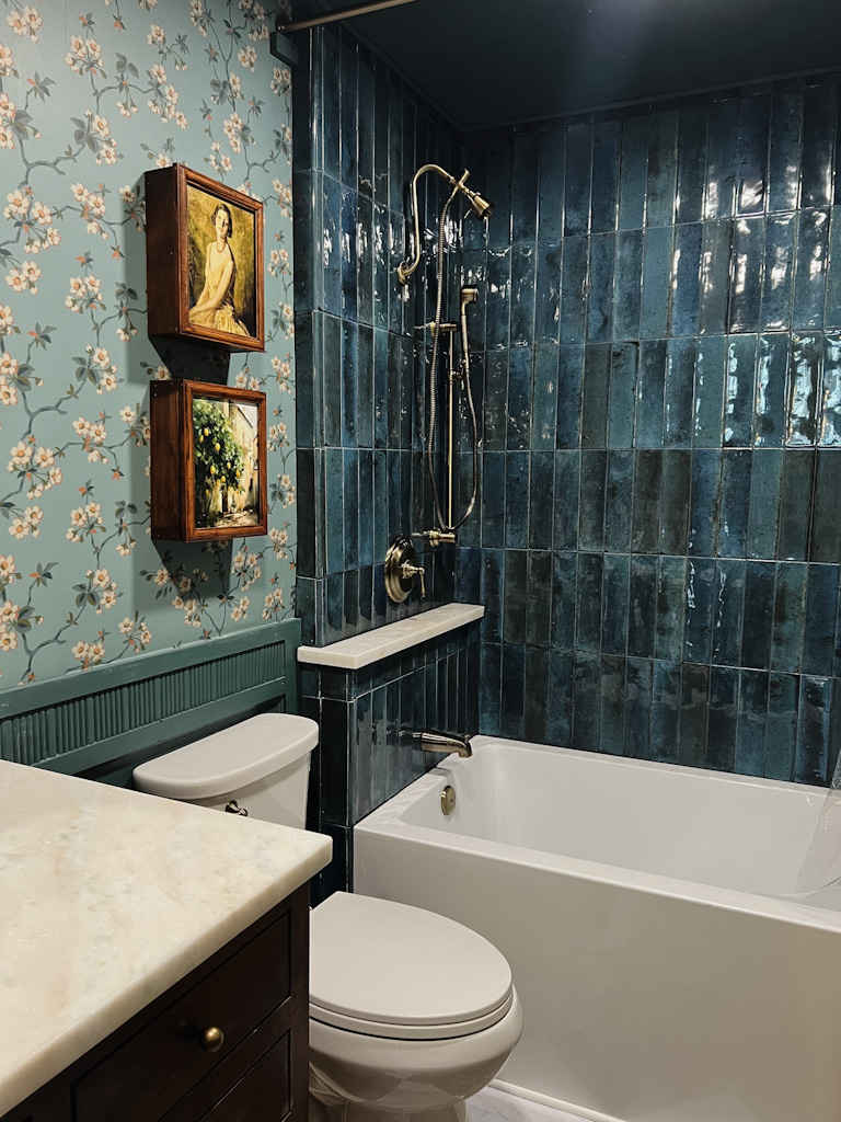
So, I came up with a plan. I decided that in this case, two is not better than one. I wanted to combine the two spaces to create a much larger and more functional bathroom. You can see from the plans below, that making this one room created so much more usable space. Kelsey requested a soaker tub, so we made that one happen as well with the Kingston Aqua Eden Soaker Tub.
Below you’ll see the original plan on the left and the new design on the right.
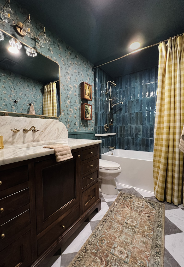
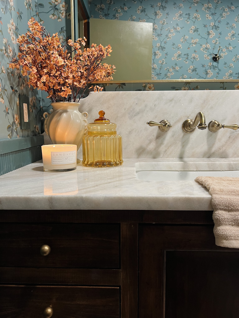
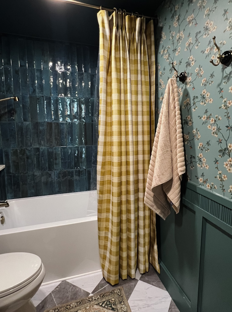
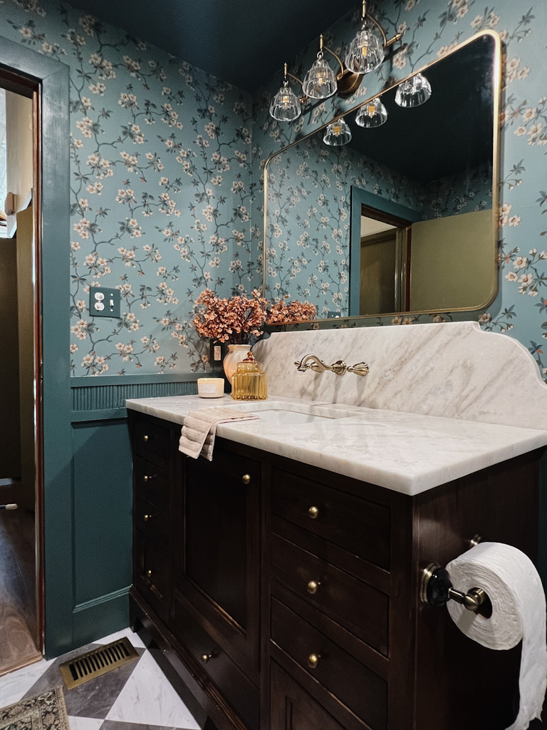
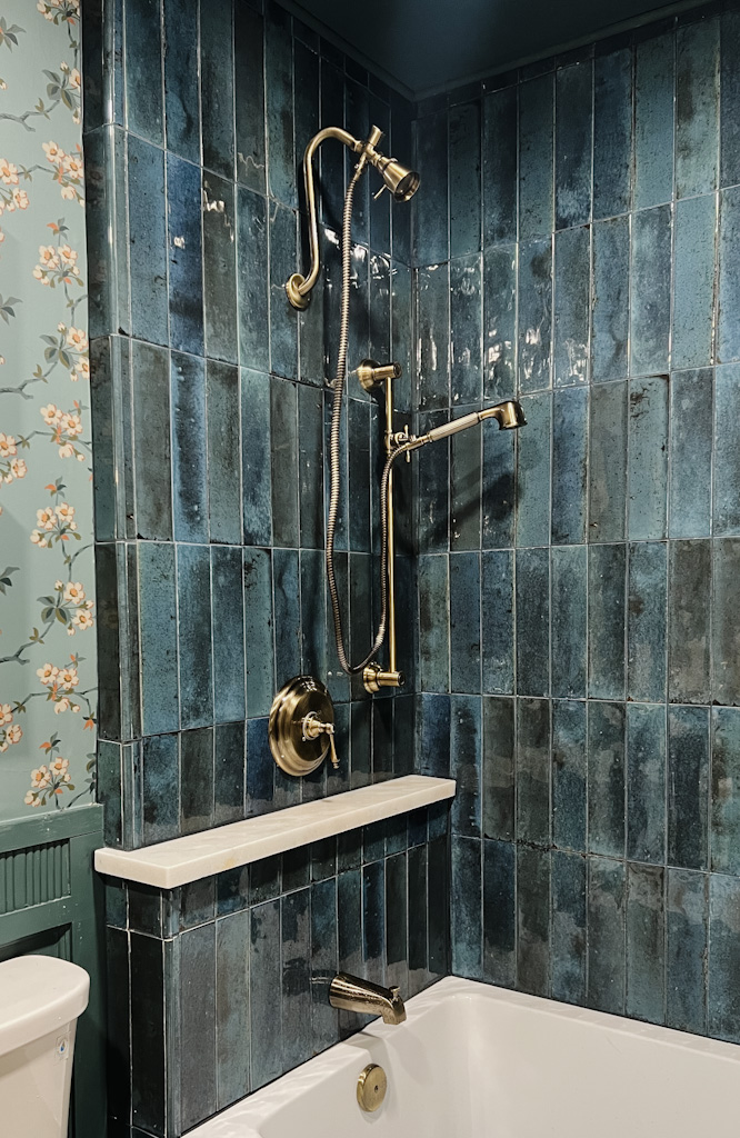
So let’s get to the good stuff, the design. Kelsey and I fell in LOVE with this wallpaper from WallpaperDirect.com and we built the entire design around it. Starting with the most beautiful fixtures in Antique Brass from Kingston Brass. I would define Kelsey’s style as academic maximalist. I added a bit of my southern vintage charm to the space and the rest is history. It turned out better than I ever imagined.
Scroll Down to see all the sources!
SOURCES:
Shower Tile: Verona Group Hope Blue (similar)
Grout: Mapei Flexicolor Night Sky
Paint Color: Inchyra Blue by Farrow and Ball (satin on trim, flat on ceiling)
Vanity: Custom made by me!
Vanity Stain: Mixwax Dark Walnut Gel Stain
Countertops: White Champagne Marble


LOVE LOVE LOVE! Every single detail !
Kassy, you are so talented and very smart!!
I’d love to see a pic without the rug ? It’s very pretty but distracts from the overall view. But what does this old lady know??🙄
I can’t wait to see what’s next!🥰
Beautiful! Show a closeup of the pictures on the wall.